Previous

Next
Home > Working with Application Pages > About the Page Definition > Editing a Page in Component...
 Previous |
 Next |
A page is the basic building block of an application. Each page has a page number, a name, and typically some text attributes such as a header, title, and footer. You add content to your page by creating page controls (regions, items, and buttons). Page templates and page region templates control the exact look and feel of each page.
Topics:
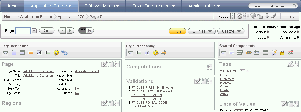
Each Page Definition is divided into three sections: Page Rendering, Page Processing, and Shared Components. Each of these sections is broken into subsections with headings that identify the type of control, component, or application logic.

To edit a component, drill down on the component name or click the icon described in the following sections.
Topics:
You can edit all controls, components, or logic within a given subsection by clicking the Edit All icon that displays to the right of the subsection title. The Edit All icon resembles a small grid with a pencil on top of it.

Clicking the Edit All icon displays pages that enable you to edit or delete multiple controls, components, or application logic simultaneously or view a history of recent changes.
For example, selecting the Edit All icon under Regions displays a summary report of all currently defined regions on the current page. You can use this summary view to:
Edit the multiple attributes at once by making selections from the available fields and select lists.
Link to a definition page by clicking the Edit icon.
You can access similar summary views on other pages by selecting a different page from the Page pop up list. To save your edits to any summary view, click Apply Changes.
You can also view the attributes of a specific control or component by selecting its name on the Page Definition. For example, suppose your Page Definition contains a region named Customers. Clicking the region name Customers would display a region definition page for that region.
You can copy or create controls or components by clicking the Copy and Create icons. The Copy icon resembles two small overlapping pages. Click the Copy icon to make a copy of an existing control or component.

The Create icon resembles a plus (+) sign overlapping a small page. Click the Create icon to create a control or component.

You can quickly change the order in which regions, buttons, and items display using the Reorder icon on the Page Definition. The Reorder icon displays as a light gray downward arrow and upward arrow.

To reorder page components, click the Reorder icon. When the Reorder page appears click the up and down arrows and then click Apply Changes.
Page rendering is the process of generating a page from the database. See "About Page Rendering".
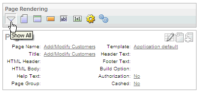
In Component view, you can navigate to a specific subsection by clicking the icons beneath the heading. When you select one of these icons, the subsection appears and all other subsections are temporarily hidden. To restore the view, click Show All. The Show All icon resembles an inverted triangle.

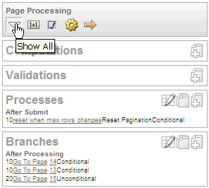
Page processing is the process of submitting a page. A page is typically submitted when a user clicks a button. Use the Page Processing section of the Page Definition to specify application logic such as computations, validations, processes, and branches. In general, the Application Express engine runs this logic in the order it appears on the Page Definition.

You can quickly navigate to a specific subsection by clicking the icons beneath the heading. When you select one of these icons, the subsection appears and all other subsections are temporarily hidden. To restore the view, click Show All. The Show All icon resembles an inverted triangle.
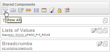
The Shared Components section of the Page Definition contains common elements that can display or be applied on any page within an application.

You can quickly navigate to a specific subsection by clicking the icons beneath the heading. When you select one of these icons, the subsection appears and all other subsections are temporarily hidden. To restore the view, click Show All. The Show All icon resembles an inverted triangle.